Comic and print lookby Herbistry · for Final Cut Pro & Motion
Comic Book
Your footage, printed. Comic Book turns video into a comic page: halftone dots, ink lines, flat bands of shading, off-register color, even a page border to sit it on. Eight styles to start from, and a control for everything else.
The short version
What Comic Book does
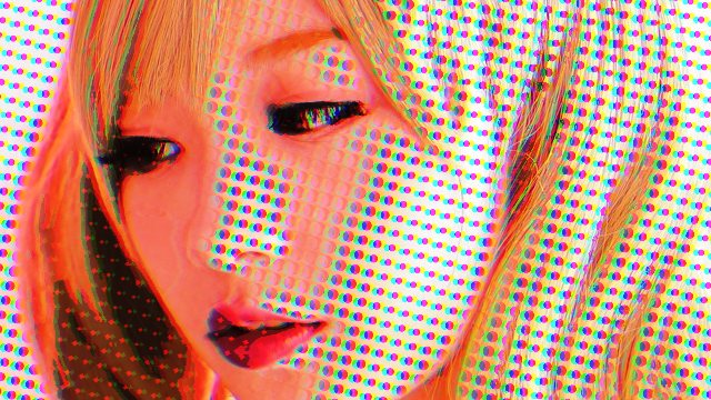
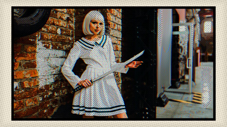
Comic Book redraws your picture the way a comic is printed. The colors snap into flat bands of shading, a screen of dots fills the shadows and highlights, ink lines trace the edges, and a slight print error pushes the red and blue apart. Pick a style and the whole look lands at once. Then change anything you like.
It is one effect with a lot of dials, and this manual walks every one. The look (dots, ink, shading, color, finish) works the moment you drop it on a clip. The extras (a page frame, animated dots, hand-drawn timing, steadier video, and a subject you can treat differently) are there when you want them. In Final Cut Pro it also comes as Pages: a generator that lays your clips out as a comic page, and a transition that turns the page.
The look
On from the first drop
Dots: a halftone screen in black or in four print colors, in seven shapes.
Ink: lines traced from the picture, either Classic or Designed.
Shading: the picture flattened into a few bands, with optional pen hatching in the shadows.
Color and finish: contrast, saturation, temperature, print offset, paper grain.
The extras
Switch on when you want them
Frame: sit the picture on a printed comic page, in four page styles.
Dot Animation: boil, drift, rotate, pulse or vibrate the dots.
Frame Hold: hold each picture for two, three or four frames, like hand-drawn animation.
Stability: calm the shimmer that video noise causes in the bands and lines.
Subject: pick a person, a face, a brightness range or a color, and give it fewer dots and less ink.
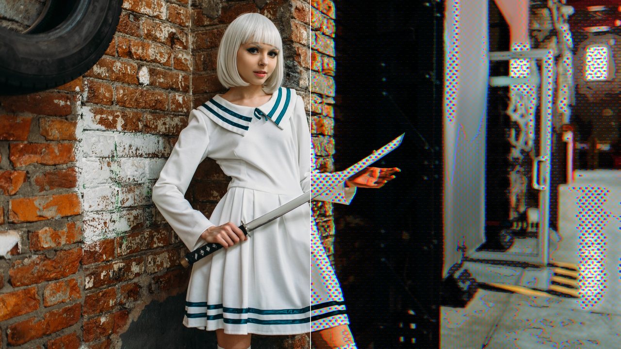
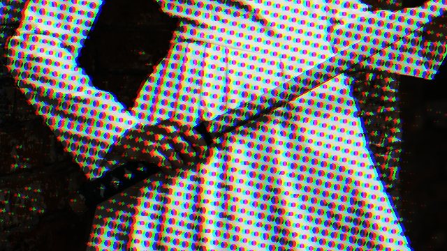
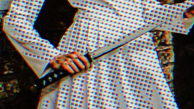
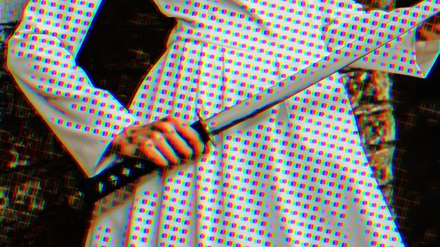
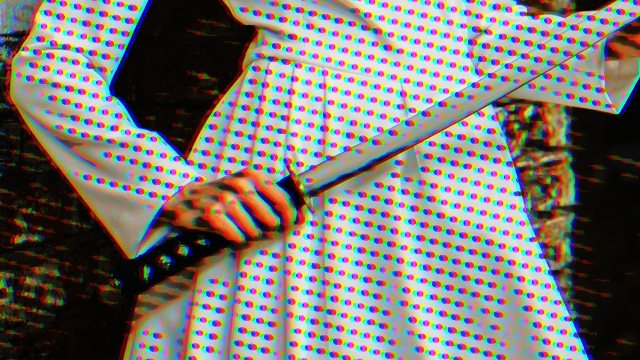
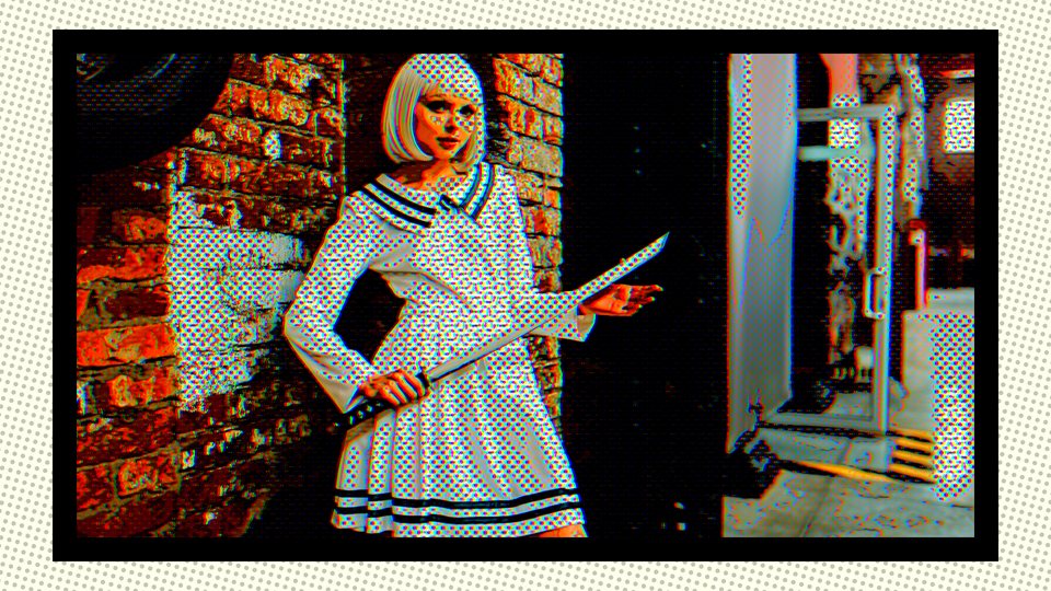
Before (left) and after (right) with the Offset Comic style. All the pictures in this manual are renders of the effect on photographs, so you can see the controls without any footage of ours in the way.
First run
Install, try, and buy Comic Book
Comic Book installs through FxFactory, the free plugin manager many Final Cut editors already have. Here is the whole path.
Install it. Get FxFactory if it is not on your Mac yet, quit Final Cut Pro and Motion, then find Comic Book by Herbistry in the FxFactory app and click its status checkbox to download and enable it. Open your editing app again and it is there.
Add it to a clip. Comic Book is an effect. In Final Cut Pro, open the Effects browser (Command-5), click the Herbistry category, and drag Comic Book onto your clip. In Motion it is a filter: Library ▸ Filters ▸ Herbistry ▸ Comic Book. In Final Cut Pro you will also find Comic Book as generators and page turns: see Pages.
Try it free. Every style and every control works right away. The catch: a tiled Herbistry leaf watermark sits over the picture, and the word TRIAL flashes across the frame for half a second every 7 seconds. Great for auditioning. Not for a clean export, which is the point.
Buy it. The Licensing row near the top of the inspector reads Trial, with a Buy button that takes you to Comic Book in FxFactory. Buy it there and the row flips to Licensed. No key to paste. With an older FxFactory the row may keep reading Trial until you quit and reopen Final Cut Pro or Motion. No FxFactory yet? Buy opens FxFactory's download page instead. Install it, quit and reopen Final Cut Pro or Motion, then press Buy again.
After you buy
The mark comes off by itself. Clips that are open lose it right away. If a stretch that Final Cut rendered during the trial still shows the mark, choose File ▸ Delete Generated Library Files, select Delete Render Files, and click OK. Final Cut then renders it again without the mark.
Your Macs and your purchase are managed in the FxFactory app. The Help button in the Licensing row opens this manual.
Where it goes
One clip or a whole stretch
Comic Book is an effect, and an effect belongs to the clip it sits on. To give a run of clips one shared look, give them one clip to share. In Motion, drop it on a layer or a group from Library ▸ Filters ▸ Herbistry; the controls then live in the Filters tab of the Inspector, in the order this manual walks them.
One clip
Effects ▸ Herbistry
Drag Comic Book onto the clip, like any other effect.
Each copy has its own settings, so two clips can wear two different styles.
Frame Hold counts from the first frame of that clip.
A stretch of clips
Compound clip or adjustment clip
Select the clips and choose File ▸ New ▸ Compound Clip (Option-G), then put Comic Book on the compound clip.
In Final Cut Pro 11.1 or later you can also use an adjustment clip: Edit ▸ Add Adjustment Clip (Option-A) puts a transparent clip over the timeline, and effects on it apply to every clip beneath it.
The stretch is then one picture to Comic Book, with one set of controls.
Start here
How a look is built
Drop Comic Book on a clip and it is already working: a fresh drop is the Offset Comic style at Intensity 75. Behind the inspector is a short chain, and each stage has its own controls. Learn which stage a control belongs to and the inspector stops being a wall of sliders. Style sets the starting point, shading and dots are the print, ink is the drawing, Color Offset and Paper Texture are the printing press, and Intensity is the volume knob.
Stage
Its controls
The question it answers
1. Smooth
Smoothing
How much is the picture softened before anything is drawn on it?
2. Color and shading
Contrast, Shadow Lift, Shading Levels, Tone Softness, Color Boost
How many flat bands of brightness, and how rich is the color?
Which starting point, which timing, which part of the picture?
The layout
The inspector, top to bottom
Everything lives in one inspector, and rows that don't apply stay hidden. Here is the map in the order you meet it. Green headings mark the sections in both apps. In Motion the four Options groups start closed: twirl them open with the arrow. In Final Cut Pro the same rows sit in one flat list.
Top of the panel
Comic Book banner the name and version
Licensing Trial or Licensed, Buy during the trial, and Help
Style eight starting looks
Intensity how much of the effect you see
Preserve Luminance keep your original brightness
Dots & Hatching
Halftone Style, Dot Shape, Halftone Coverage what the dots are
Halftone Dot Size, Halftone Amount, Halftone Dot Evenness how big, how loud, how uniform
Advanced the checkbox that opens the sliders below
Ink and line Smoothing, Line Weight, Ink Darkness, Line Style, Line Variation, Line Taper
Tone and shading Contrast, Shadow Lift, Shading Levels, Tone Softness, Hatch Strength, Hatch Size, Hatch Angle, Spot Black
Color Color Boost, Temperature
Print finish Color Offset, Paper Texture
"Where did that row go?"
Rows hide when they would do nothing. Frame Options rows wait for Frame On. Dot rows hide at Halftone Amount 0. Animation Speed needs a Dot Animation other than Off; Animation Anchor shows for Drift, Rotate and Pulse. Subject rows wait for a Subject other than Off, each source showing only its own; Subject Dots also needs the dots or Shadow Hatching on; Feather and Invert also wait until Subject Dots or Subject Ink has been moved, because until then there is nothing for them to change. Advanced sliders wait for Advanced; Line Variation and Line Taper need the Designed Line Style; the Hatch rows need Shadow Hatching on.
Every control
The controls, and why you'd reach for each one
Grouped the way the inspector is, top to bottom. For every control: what it does, the range it runs over, what it starts at, and when it shows up.
The starting point
Style
Popup · 8 styles
Picks a whole look in one move: Inked, Cel / Anime, Pop-Art, Manga B&W, Offset Comic, Vintage Newsprint, Screen Print or Film Noir. A Style is a starting point, not a lock. It sets the dots, the shading, the ink and the finish together, and every one of those controls stays yours to change afterward. A fresh drop is Offset Comic. What each Style sets is in The eight styles.
Pick the Style first, then tweak. Choosing a Style writes its values into the controls listed below, so it overwrites anything you set on them earlier. This includes the rows under Advanced Options even while Advanced is off and they are hidden.
A Style rewrites
Halftone Style, Dot Shape, Halftone Coverage, Dot Size, Amount, Evenness, Shadow Hatching, and every row under Advanced Options.
How much of the effect you see, blended against your original clip. It is the last blend in the chain, after everything else, so it is the one slider to pull when a look is right but there is simply too much of it. And because it keyframes, this is your fade-in: ramp it from 0 to 100 and the picture prints itself in.
At 0
Your original clip. The effect is bypassed.
At 100
The full look. Nothing of your original shows through.
Default 75 · Intensity does not go past 100
Preserve Luminance
Checkbox
Keeps the styled picture's brightness close to your original, so the look does not go darker or washed out as you stack up shading, contrast and ink. It rescales the styled picture toward the original's brightness, never by more than half or double, and it happens before Intensity. Turn it off to let the look set its own brightness, for example for a deliberately dark noir.
Default On · always visible, right under Intensity · no Style touches it
Dots and hatching
Halftone Amount
0 to 100 · the dots' master
How loud the dots are. It is the master of the dot section: at 0 the dots are off completely, and the other dot rows (Halftone Style, Dot Shape, Halftone Coverage, Halftone Dot Size, Halftone Dot Evenness and Dot Animation) hide because they would do nothing. Dots still follow Intensity and the Subject controls.
At 0
No dots. The dot rows tuck away.
At 100
The screen at full strength. The dots are the look.
Default 70 (Offset Comic) · every Style sets its own
Halftone Style
Popup · 2 choices
Color Dots prints four overlapping screens, cyan, magenta, yellow and black, each at its own angle, the way a real print does. The dots pick up the color of the picture. Mono Dots prints one black screen. Simpler, and the classic newspaper look.
Default Color Dots (Offset Comic) · Shows when Halftone Amount is above 0
Dot Shape
Popup · 7 shapes
Round is the classic dot. Square, Ellipse, Line, Cross, Rings and Stipple are the other six. Square, Ellipse, Line, Cross, Rings and Stipple print the same amount of ink for the same tone, so switching between them changes the texture, not how dark the picture is. Round sizes each dot from the pixel under it; the other six size from a small local average, which keeps them steadier. Ellipse is wider than it is tall (1.5 to 1). Rings are centered on the Animation Anchor. Stipple scatters each dot slightly off its grid point to break up patterns.
Default Round · Shows when Halftone Amount is above 0
Halftone Coverage
Popup · 2 choices
Where in the tones the dots land. Full Range puts dots across every tone. Shadows & Highlights prints them in the dark and bright areas and leaves the midtones clean, which keeps faces and big flat areas calmer. The dots fade in from middle gray: none at 50% brightness, full strength at 15% and below and at 85% and above. A color of middle brightness, such as an olive green or a skin tone, gets few dots, so switch to Full Range if an area looks bare.
Default Shadows & Highlights (Offset Comic) · Shows when Halftone Amount is above 0
Halftone Dot Size
0 to 100
How big the dots are. Higher means bigger and fewer. It sets how many dots fit up the height of the frame: about 120 at 0 and about 20 at 100, and it scales with the frame, so a 4K picture shows the same dots as a 1080 one.
Low
Fine screen. Reads as shading from a distance.
High
Big dots. Reads as dots at any distance.
Default 40 (about 80 dots up the frame) · Shows when Halftone Amount is above 0
Halftone Dot Evenness
0 to 100
Whether dot size follows brightness. At 0 each dot is sized by the brightness under it: big dots in the dark, small in the light. At 100 every dot is the same size.
Default 20 (Offset Comic) · Shows when Halftone Amount is above 0
Shadow Hatching
Popup · Off / Hatch / Cross-Hatch
Pen lines across the shadows. Hatch draws one layer of parallel lines. Cross-Hatch adds a second layer at a different angle (60 degrees from the first) in the deeper shadows, so the darkest areas get a woven look. The darker the tone, the wider the line, but the number of lines is fixed by Hatch Size, so lines never pop in or out as a tone changes. They hold still, with no shimmer. Hatching does not need the dots, so it is always visible. Its strength, spacing and angle are under Advanced Options (Hatch Strength, Hatch Size, Hatch Angle).
Default Off · every Style sets it (all eight are Off today)
Subject Options
One popup picks the subject, and a small set of rows decides what the effect does to it. The whole idea is less: the subject can lose dots and lose ink. It can never gain more than the effect already gives. The full story, with the limits, is in Subject below.
Subject
Popup · 6 choices
Chooses what counts as the subject: Off, People (a person's outline), Faces (an oval around each face), People + Faces, Luminance Range (a band of brightness) or Color Key (colors near one you pick). Off is the effect exactly as it was. When Subject is anything but Off, the rows below appear, and each source shows only its own rows. Picking a source changes nothing by itself: see Nothing changes until you move a slider in the Subject chapter.
Default Off · always visible
Luminance Low
0 to 100
The darkest brightness that counts as the subject. Everything from Low to High is the subject, with a soft edge just outside the band. If you set Low above High, Comic Book swaps them for you.
Default 0 · Shows for Luminance Range
Luminance High
0 to 100
The brightest brightness that counts. With Low at 0 and High at 100, everything is the subject, which is where it starts. Pull Low up to pick out the bright parts, or High down to pick out the dark parts.
Default 100 · Shows for Luminance Range
Key Color
Color
The color to key on. Anything close to it counts as the subject. It starts as a skin tone, because the usual job is a face or a hand. Pick the color from the swatch. The key compares your original footage, not the styled picture in the viewer, so a color you pick off the screen can differ slightly from the color in the source.
Default A skin tone · Shows for Color Key
Key Tolerance
0 to 100
How far from the Key Color a color may be and still count, with a soft edge just outside. Low is strict, high lets in neighbors.
Default 50 · Shows for Color Key
Feather
0 to 100
Softens the subject's edge. At 0 it is the source's own edge. At 100 the edge becomes a wide soft ramp that reaches about 24 pixels to each side of the edge at 1080, scaling with the frame. A softer edge hides a rough outline.
Default 10 · Shows when Subject is not Off and Subject Dots or Subject Ink has been moved off its default
Invert
Checkbox
Swaps the subject and the background. Whatever was the subject is now the background, and the rest of the picture is the subject. With Luminance Range or Color Key, clear (fully transparent) areas of the clip are never picked, so Invert turns them into subject.
Default Off · Shows when Subject is not Off and Subject Dots or Subject Ink has been moved off its default
Subject Dots
0 to 100
How much of the dots and the hatching the subject keeps. 100 is as much as everywhere else. 0 is none, a clean subject. It only reduces. It cannot add dots. With Halftone Amount at 0 and Shadow Hatching Off there is nothing to remove, so the row hides.
Default 100 · Shows when Subject is not Off and the dots or Shadow Hatching are on
Subject Ink
0 to 100
How much of the ink the subject keeps: both the edge lines and Spot Black. 100 is as much as everywhere else, 0 is none. Like Subject Dots, it only reduces.
Default 100 · Shows when Subject is not Off
Animation Options
Dot Animation
Popup · 6 choices
Moves the dots, and only the dots. The picture itself stays still. Off keeps them locked to the frame. Boil jumps the screen to a new random position in steps, like hand-redrawn frames. Drift scrolls the dots in the direction of the Animation Anchor, measured from the middle of the frame. With the Rings dot shape it does not slide them: the rings grow outward from the Anchor instead. On the Line shape, Drift can look still when the Anchor sends the dots along the direction the lines already run. Rotate turns the screen around the Anchor; Rings are round, so Rotate shows no change on them. Pulse swells and shrinks the screen around the Anchor by up to 30 percent. Vibrate wobbles the dots a little, mostly side to side, in place.
Default Off · Shows when Halftone Amount is above 0 · it is not a keyframe row. Pick it once per clip.
Animation Speed
0 to 100
How fast the animation runs. 50 is normal speed, 100 is double, and 0 is still. One exception: Boil never fully stops. At speed 0 it still jumps 8 times a second, and at 100 it jumps 40 times a second. To freeze the dots, set Dot Animation to Off.
Default 50 · Shows when Dot Animation is anything but Off
Animation Anchor
Point
A point in the frame. Drift scrolls the dots in its direction from the middle of the frame (to the right when it is centered; Rings grow outward from it instead), and Rotate and Pulse pivot around it. Rings (a Dot Shape) are centered on it too, whatever the Dot Animation. The row only shows for Drift, Rotate and Pulse, but its value is kept: to place the Rings, switch Dot Animation to one of those three, set the point, then switch it back to Off. The Rings stay where you put them. Set it with its X and Y values.
Default The center of the frame · Shows for Drift, Rotate or Pulse
Time
Frame Hold
Popup · Off / On Twos / On Threes / On Fours
Hand-drawn timing. Instead of a new picture every frame, Comic Book shows one picture and holds it for two (On Twos), three (On Threes) or four (On Fours) frames, like animation drawn on twos. At 24 fps, twos is 12 pictures a second. The holds are counted in timeline frames, the frames of your project, not the frames of the source file. Always visible, applies to every look, and no Style touches it. The details, including what cuts and transitions do, are in Frame Hold and Stability.
Default Off
Stability
0 to 100
Calms the shimmer that video noise puts into the shading bands and the ink lines. A flat patch that noise nudges back and forth across a band edge flickers from one band to the next. Stability blends each frame with the two frames before it, before the look is drawn. Pixels that actually moved keep their own value, so moving things ghost much less. The ink lines are drawn from the steadied picture too. Only Intensity and Preserve Luminance still compare against the original frame. At 0 it is off, and the effect asks the app for no extra frames.
Low
Only the faintest changes count as noise. Gentle.
High
More change counts as noise. Steadier, but slow motion can start to smear.
Default 0 (off) · Above 0 the app has to fetch two extra frames, so playback is heavier
Frame Options
Frame
Popup · Off / On
Off: the look fills the frame edge to edge. On: the styled picture is set on a printed comic page, with paper, a border, and a page background of its own. The page is opaque, so it covers whatever is behind the clip. Turning Frame on reveals the four rows below.
Default Off · Group Frame Options
Frame Style
Popup · 4 pages
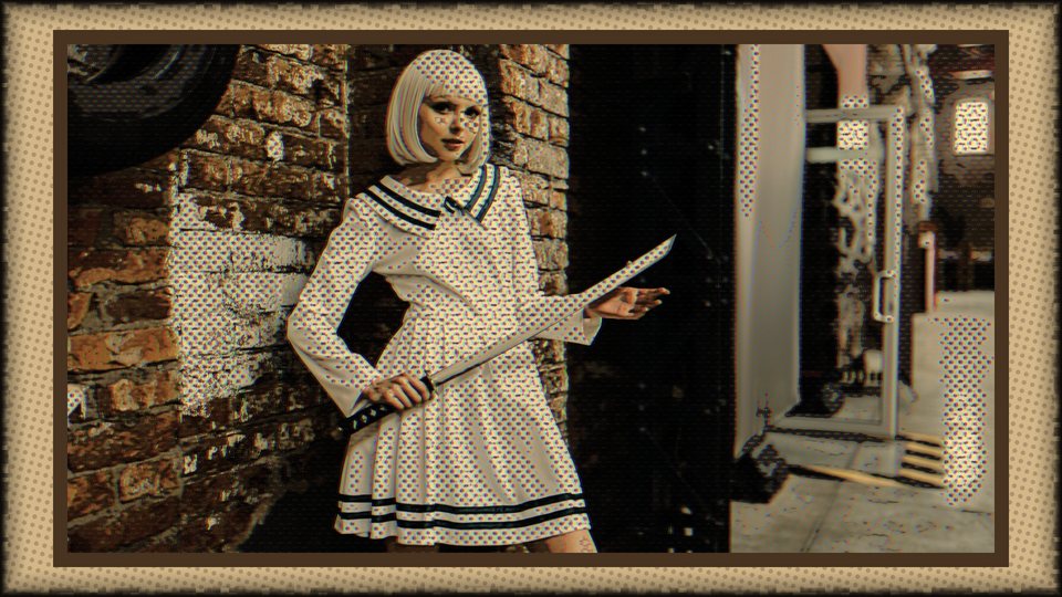
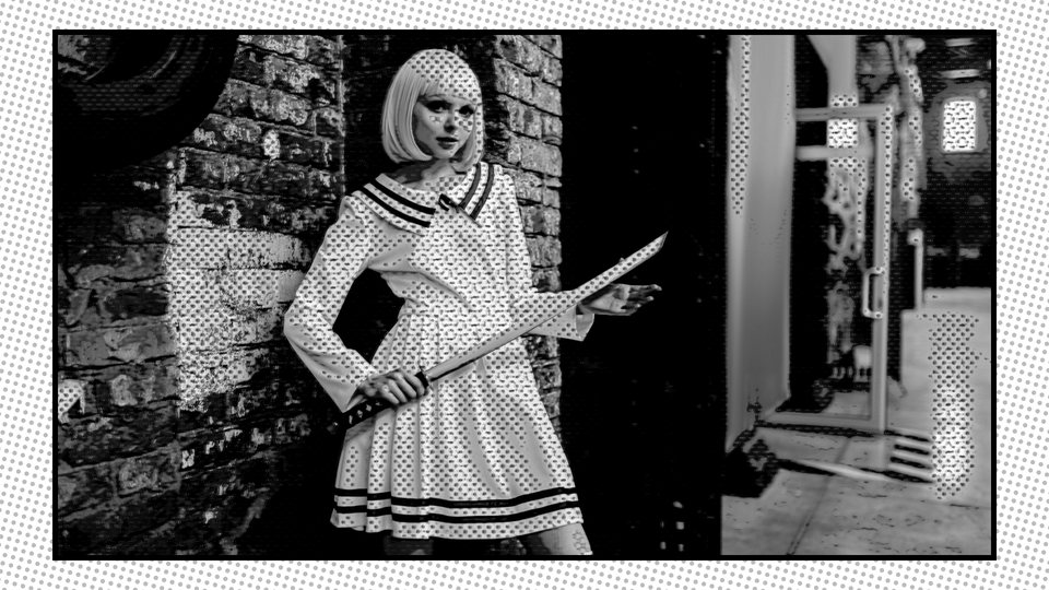
The kind of page. Classic: cream paper, a medium black border. Vintage: aged sepia paper, a brown border, a ragged torn edge, and the picture toned sepia. Manga B&W: a white page with a thin border and a dense screentone behind the picture, which itself turns black and white with extra contrast. Bold / Pop: a white page with a thick black border and richer, punchier color. The page's color treatment applies to the footage on it, not just the paper.
Default Classic · Shows when Frame is On · picking one sets Frame Color and Border Width
Frame Color
Color
The color of the page border. Choosing a Frame Style sets it (black for Classic, Manga B&W and Bold / Pop, a dark brown for Vintage), so pick the Frame Style first and change the color after.
Default Black · Shows when Frame is On
Source Width
20 to 100
How big your footage sits on the page, scaled down evenly from the center. At 100 it fills the frame and the border sits right on its outer edge. Lower, and more page shows around it.
Default 90 · Shows when Frame is On
Border Width
0 to 100
How thick the border is. It is drawn on the inside edge of the footage, so changing it never resizes the picture. At 0 you still get a hairline.
Default 40 · Shows when Frame is On · picking a Frame Style sets it
Advanced Options
Normally the Style drives all of these. Tick Advanced and they appear as live sliders you can tune. The values apply whether or not Advanced is ticked: unticking it only hides the rows, it does not reset them. They are grouped below the way the inspector lists them: ink and line, tone and shading, color, then print finish.
Advanced
Checkbox
Shows or hides the rows beneath it. It changes no look by itself.
Default Off
Ink and line
Smoothing
0 to 100
Softens the picture before anything is drawn on it. Higher makes flatter areas and fewer stray lines. Lower keeps fine detail and every speck of texture.
Default 50 (Offset Comic)
Line Weight
0 to 100
How thick the ink lines are. Higher is a heavier, bolder pen. It drives both Line Styles.
Default 55 (Offset Comic)
Ink Darkness
0 to 100
How much of the picture gets inked. Higher inks more of the frame and goes darker. Lower inks only the strongest edges. It drives both Line Styles.
Default 45 (Offset Comic)
Line Style
Popup · Classic / Designed
Classic runs the ink after the dots, so it outlines the dots as well as the shapes, and it floods the darker tones with ink. Designed draws the line from the clean colors instead: no dot outlines, no flood, and a flat area gets no ink at all. A Designed line follows how strong the edge is, so strong edges draw heavy and weak ones draw light. See both side by side in Up close.
Default Classic (every Style) · Shows with Advanced
Line Variation
0 to 100
For Designed lines. How gradually the weight follows the edge strength. Low: most edges ink at full weight. High: weak edges stay faint, so the line breathes with the picture.
Default 50 · Shows with Advanced and Line Style on Designed
Line Taper
0 to 100
For Designed lines. How weak an edge can be and still start a line, which is what shapes the thin tails where a line fades out. Classic ignores it.
Default 50 · Shows with Advanced and Line Style on Designed
Tone and shading
Contrast
50 to 200
Pushes the picture away from mid-gray, before it is flattened into bands. 100 is neutral, below 100 is flatter, above is harder.
Default 125 (Offset Comic)
Shadow Lift
0 to 100
Rescues crushed shadows. It lifts the dark and mid tones before the picture is flattened, so near-black detail spreads over more bands instead of collapsing into one flat black.
Default 0 (every Style)
Shading Levels
2 to 16
How many flat steps the brightness is cut into. A setting of N gives N + 1 tones between black and full brightness. Fewer is flatter and more graphic. More is smoother. It works on brightness only, so the hues are kept: it is not a count of colors.
2
Three tones: black, mid and full. Pure graphic.
16
Seventeen tones. Close to the original shading.
Default 5 (Offset Comic)
Tone Softness
0 to 100
Softens the step from one band to the next. At 0 the bands are hard. Higher gives wider, softer band edges, which stops a flat tone that noise nudges back and forth from popping between two bands.
Default 0 (every Style)
Hatch Strength
0 to 100
How dark the hatch lines ink. At 0 no hatch lines are drawn at all.
Default 60 · Shows with Advanced and Shadow Hatching on
Hatch Size
0 to 100
The spacing of the hatch lines. Higher means fewer, wider-spaced lines: from about 110 lines up the frame at 0 to about 30 at 100.
Default 50 · Shows with Advanced and Shadow Hatching on
Hatch Angle
0 to 180 degrees
The direction of the hatch lines. Cross-Hatch's second layer sits 60 degrees from this one.
Default 45 · Shows with Advanced and Shadow Hatching on
Spot Black
0 to 100
Solid black ink in the very deepest tones, the filled-in blacks of an inked comic, as a control of its own. At 0 there are none. The Subject Ink slider scales it too.
Default 0 (every Style) · Shows with Advanced
Color
Color Boost
0 to 200
Saturation. 100 leaves the color as it is, 0 is black and white, and 200 doubles it.
0
Black and white. The manga and noir end.
200
Double the color. The pop-art end.
Default 150 (Offset Comic)
Temperature
-100 to 100
Cools or warms the finished picture. 0 is neutral. Positive pushes warm, toward sepia. Negative pushes cool and blue.
Default 5 (Offset Comic)
Print finish
Color Offset
0 to 100
The off-register print error: the red and blue channels slide apart sideways, leaving a colored fringe on edges, like a plate that did not line up. Its size scales with the frame, so a 4K picture shows the same fringe as 1080.
Default 55 (Offset Comic)
Paper Texture
0 to 100
A fine, aged-paper grain over the finished picture, plus a coarser layer that stays visible when the picture is small and takes over around the middle of the slider. It works with Frame on or off. With Frame on, the grain sits on the footage only: the page paper and border around it get none, because the page has its own look from Frame Style. The grain is locked to the picture, so it does not crawl as things move, and Intensity scales it along with everything else.
Default 20 (Offset Comic)
Starting points
The eight styles
Each picture is split: your original on the left, the styled picture on the right. A Style sets the halftone controls shown on each card, plus the character sliders in the table below it. Everything is yours to change once it lands.
Punchy color with a visible red and blue print fringe and medium color dots. What a fresh drop gives you.
Vintage Newsprint
Mono Dots · Full Range · Size 75 · Amount 30 · Evenness 40
Faded color, a strong sepia warmth, heavy paper grain, coarse black dots.
Screen Print
Color Dots · Full Range · Size 50 · Amount 45 · Evenness 20
Flat, limited color and a registration drift between the colors. Color dots a step bigger than Offset Comic's.
Film Noir
Mono Dots · Full Range · Size 50 · Amount 30 · Evenness 0
Three tones only, black and white with a cool tint, heavy ink. Light dots that follow the tones.
What each Style sets in Advanced Options
Style
Smooth
Line Wt
Ink Dk
Levels
Boost
Contrast
Offset
Paper
Temp
Inked
50
55
50
6
140
120
10
15
10
Cel / Anime
85
40
60
4
130
110
0
0
0
Pop-Art
80
65
50
3
180
140
0
10
0
Manga B&W
40
50
45
3
0
140
0
10
-10
Offset Comic
50
55
45
5
150
125
55
20
5
Vintage Newsprint
55
50
50
3
40
110
25
85
70
Screen Print
70
45
55
3
110
100
40
40
20
Film Noir
50
70
40
2
0
160
0
5
-20
Smooth is Smoothing, Line Wt is Line Weight, Ink Dk is Ink Darkness, Levels is Shading Levels, Boost is Color Boost, Offset is Color Offset, Paper is Paper Texture and Temp is Temperature.
All eight use Round dots, the Classic Line Style (Line Variation 50, Line Taper 50), Tone Softness 0, Shadow Lift 0, Spot Black 0, and Shadow Hatching Off (Hatch Strength 60, Hatch Size 50, Hatch Angle 45). The extras are there to switch on, on top of whichever Style you pick.
See it
The controls, up close
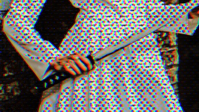
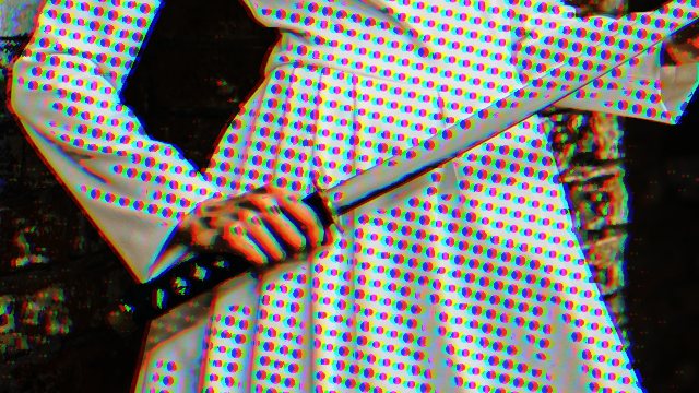
Each picture below is a 100 percent window onto a render of the effect, changing one thing and leaving the rest alone, so you can see exactly what that one control does. They are renders of the effect on photographs, not screenshots of the app.
Halftone Style
Color Dots
Four screens, cyan, magenta, yellow and black, each at its own angle. They pick up the color of the picture.
Mono Dots, Round
One black screen. This is also the Round dot shape: the others are next.
Halftone Coverage
Full Range
Dots in every tone, midtones included.
Shadows & Highlights
Midtones stay clean. The dots keep to the darks and the brights.
Dot Shape
Square
Blocky, with a flat-print feel.
Ellipse
Wider than tall, 1.5 to 1.
Line
A line screen: the line fattens as the tone darkens.
Cross
Small plus signs that grow with the tone.
Rings
Concentric rings around the Animation Anchor. Here the Anchor is at the center of the picture.
Stipple
Dots scattered a little off the grid, so there is no regular pattern.
Shadow Hatching
Off
Manga B&W as it comes.
Hatch
One layer of lines across the shadows.
Cross-Hatch
A second layer crosses the first, in the deepest shadows only.
Manga B&W with Hatch Strength 100 and Hatch Size 70. The second layer of Cross-Hatch only starts in the deeper shadows, so on a picture with few of them the two look close.
Line Style
Classic
The ink runs after the dots, so it outlines them as well as the shapes.
Designed
The line is drawn from the clean colors: edges of shapes, and no dot outlines.
Offset Comic, Mono Dots at Halftone Amount 100, changing only Line Style. The difference lives on the edges of the dots, so look closely.
Frame Style
Classic
Cream paper, a medium black border. Border Width 40.
Vintage
Aged sepia paper, a brown border, a torn edge, toned art. Border Width 50.
Manga B&W
A white page, a thin border, dense screentone, black and white art. Border Width 14.
Bold / Pop
A white page, a thick black border, richer color. Border Width 90.
Frame On with Source Width at its default of 90, on the Offset Comic style.
Timing
Frame Hold and Stability
Two controls that work on time, not on the picture. Neither can be shown in a still, so here is exactly what each one does.
Frame Hold
Counted in timeline frames
Twos · Threes · Fours
On Twos holds each picture for 2 frames of your project, On Threes for 3, On Fours for 4. In a 24 fps project, twos is 12 pictures a second, whatever frame rate the source file has.
Where the count starts
At the clip's head
Counting starts at the first frame of the clip Comic Book sits on, so the groups line up from the clip's start. Cut that clip in two with the blade and the second piece starts its own count at its own first frame. Outside the clip nothing is held.
Worked out from the time
Predictable
Which picture is held depends only on the time being drawn and on the clip's timing, not on what was drawn before it. A held picture is never later than the playhead.
Transitions
Edges of a clip
A transition on a clip extends the stretch of footage the effect sees by the transition's length. Final Cut Pro counts the groups from that earlier start, so a clip with a transition can fall into different groups than the same clip without one, along the whole clip and not only near the transition.
Mixed frame rates
Expected, not a bug
If the source frame rate differs from the project's, for example a 23.976 clip in a 29.97 project, the held groups take turns stepping one and two source frames. The hold looks very slightly uneven. That is the two frame rates beating against each other, not Comic Book.
Everything under it holds too
Stack order
Effects you stacked before Comic Book are held with the picture. The dot animation steps with the picture, so a held frame shows the dots held too. During the trial, the TRIAL flash stays on real time.
Stability
What it blends
The two frames before
With Stability above 0, each frame is blended with the two frames before it (the two previous held frames when Frame Hold is on) before the look is drawn. That calms the flicker in the bands and the lines that video noise causes. A pixel that moved keeps its own value, so there is far less ghost trail behind motion.
What it leaves alone
Your original
The Intensity blend and Preserve Luminance still use the original frame, never the blended one. So Stability steadies the shading, the dots and the lines, and the original underneath stays sharp.
How high to go
Steady vs smear
Higher counts more change as noise, which is steadier, but slow motion can start to smear. Raise it a little at a time until the flicker settles, then stop.
The cost
Heavier playback
Above 0 the effect asks Final Cut or Motion for two extra frames per frame, so live playback is heavier. At 0 it costs nothing. If playback stutters, render the shot (see Tips and limits).
Subject
Treating the subject differently
Subject lets one part of the picture, a person, a face, the bright parts, a color, get less of the print than the rest. One popup chooses the source, and everything that follows uses the same map.
Source
What it selects
Good to know
People
The outline of each person, found with the Mac's built-in person detection.
A person has to be clearly in the frame. A tiny figure may not be found.
Faces
An oval around each face, grown to take in the forehead and trimmed by the person's outline, with a soft fade at its edge.
On a painting, a statue or an illustration the outline and the face finder can disagree. Faces then uses the plain oval.
People + Faces
The person outline, plus any face the outline missed.
The safest of the three for a face that may sit outside the outline.
Luminance Range
Everything between Luminance Low and Luminance High, with a soft edge just outside.
Reads the clip as it enters Comic Book. Works on anything, with no detection.
Color Key
Colors near the Key Color, out to the Key Tolerance, with a soft edge.
Reads the clip as it enters Comic Book, not the styled picture. Works on anything.
Luminance Range
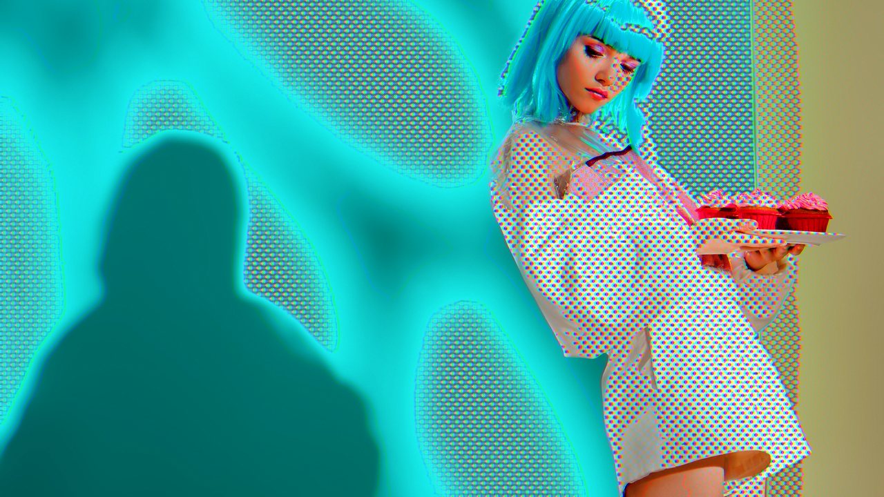
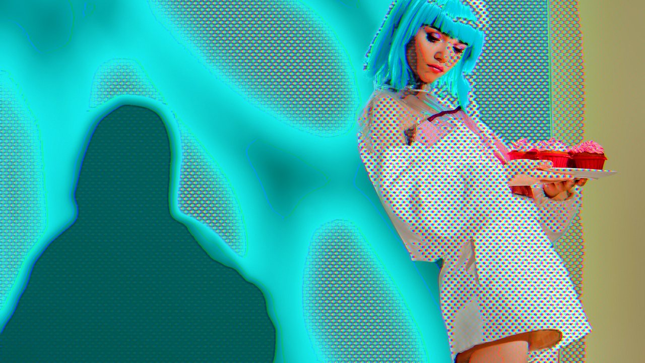
Luminance Low 20, Luminance High 50, Subject Dots 0, Subject Ink 0. The dark shadow on the wall comes out clean. Everything brighter keeps its print.
Color Key
A Key Color picked from the red of the cupcakes, Key Tolerance 35, Subject Dots 0, Subject Ink 0. The cupcakes are clean.
Color Key, Invert on
The same key with Invert ticked. The subject is now everything except the cupcakes, so the cupcakes keep their dots.
Rules every source shares
Nothing changes until you move a slider
Start here
Picking a source only decides which part of the picture is the subject. The look stays as it was until you treat the subject differently: lower Subject Dots or Subject Ink. Feather and Invert only reshape the selection, so they stay hidden until one of those two has been moved. Subject Dots only counts while Halftone Amount is above 0 or Shadow Hatching is on; with neither there are no dots to remove.
No dots where you expect them?
Check these first
A bare area is usually a Halftone setting, not the Subject. Halftone Amount at 0 prints no dots anywhere. Halftone Coverage on Shadows & Highlights keeps the dots off colors of middle brightness, so a green or a skin tone can look bare while the bright and dark areas are dotted; Full Range puts them back. The Subject only takes dots away, and only when Subject Dots is below 100. At 100 it leaves the dots as they were.
The subject can only lose
Less, never more
Subject Dots and Subject Ink reduce what the subject receives: 100 is as much as the background, 0 is none. Neither can add dots or ink the effect would not otherwise draw.
Luminance Range and Color Key read the source
Before the look
They read the picture as it arrives at Comic Book, before the look is drawn and before Stability. With Frame Hold on, that is the held frame. So changing Contrast or Shading Levels never moves what they pick out.
Clear pixels are never keyed
Transparent areas
With Luminance Range or Color Key, a fully transparent pixel is never picked. Ticking Invert turns those pixels into subject.
No one found, no subject
People and Faces
On a frame where detection finds nobody, Comic Book renders exactly as if Subject were Off: full dots and ink everywhere. Invert switches off with it. When a person walks out of shot the look can change at that frame. Frames under 100 pixels on the short side skip detection altogether.
The cost
People and Faces
People and Faces run the Mac's built-in detection as every frame renders, so they add work to playback, scrubbing and export. Luminance Range and Color Key are cheap.
How the controls play together
Which control wins
Most controls are independent. A few touch each other, and knowing which saves a lot of head-scratching.
Style, then everything else
Order matters
Choosing a Style rewrites the halftone controls, Dot Shape, Shadow Hatching and all of Advanced Options. If you tweak first and pick a Style after, your tweaks are gone. Pick the Style first.
Frame Style, then Border and Color
Order matters
Choosing a Frame Style sets Frame Color and Border Width. Set the Frame Style first, then change either one. Source Width is yours, and no Frame Style changes it.
Dots and Classic ink
Dots · Ink
Classic ink runs after the dots, so it outlines them. If you want clean lines with dots behind them, switch to Designed or turn Halftone Amount down.
Intensity and Preserve Luminance
Blend order
Preserve Luminance rescales the styled picture toward your original brightness first. Intensity then blends the result against your original.
Frame, Frame Hold, Dot Animation, Stability
Time
With Frame Hold on, the dot animation steps with the held picture, and Stability blends the held pictures. Turn Frame Hold on first and you will see the dots and the shading move together.
Subject Ink and Spot Black
Ink · Subject
Subject Ink scales both the edge lines and Spot Black. Subject Dots scales both the dots and the hatching.
Halftone Amount at 0
Hidden rows
With no dots, the dot rows tuck away. If a row you expect is missing, check Halftone Amount first.
A few starting moves
Handy setups
Not recipes for a particular picture, just combinations of controls that work together. Start from any Style and try them on your own footage.
Hand-drawn timing
Frame Hold: On Twos · Dot Animation: Boil
The picture changes every second frame, and the dots change with it. Raise or lower Animation Speed to taste. Boil never fully stops, even at speed 0.
Calmer on noisy footage
Stability up a little · Tone Softness up · Smoothing up
Stability averages the frames, Tone Softness softens the band edges, and Smoothing flattens the specks before anything is drawn. Raise them one at a time.
The person gets no dots and no ink while the background keeps both. Raise Subject Ink if you want the person outlined.
Line art only
Halftone Amount 0 · Advanced on · Line Style: Designed · Shading Levels 2
Dots off, a clean line from the colors, and three flat tones of shading. What is left is the drawing.
A page that fits the style
Pick the Style · Frame: On · Frame Style · Source Width
Choose the Style first, then turn on Frame and pick the page that suits it. Frame Style sets the border, so adjust Border Width and Frame Color after that.
Final Cut Pro only
Pages: the comic page and the page turn
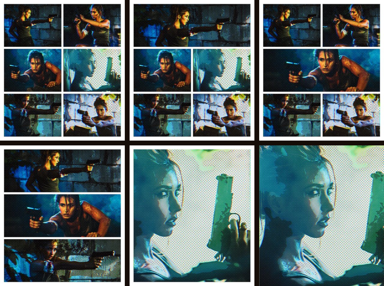
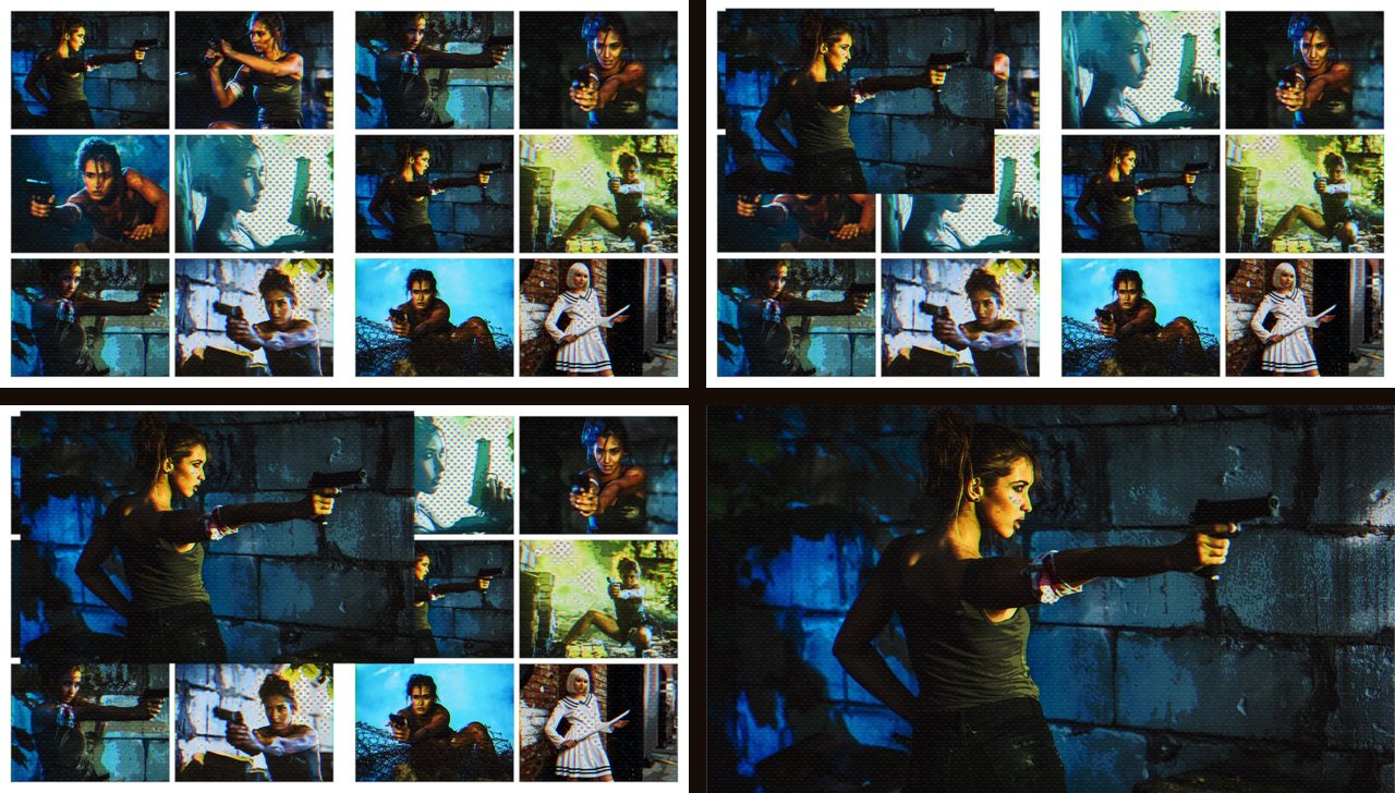
Comic Book also comes as a comic page you fill with your own clips. The Comic Book generator is an open book: two pages of up to six panels each. Comic Book Vertical is one tall page of up to six panels, for a 9:16 project. Comic Page Turn and Comic Page Turn Vertical are transitions that turn the page from one spread to the next. Find the generators in Final Cut Pro's Generators browser and the turns in its Transitions browser. Pages need Final Cut Pro, and they carry the same trial watermark as the effect. The generator shares its name with the effect, so this chapter says the generator for the page and the effect for the look you put on a clip.
The Comic Book generator in Final Cut Pro's viewer, filled with eleven clips: the left page on 2-2-2 and the right page on 2-1-2. Each page picks its own layout.
Build a spread
Add the generator. Drag Comic Book from the Generators browser into the timeline. A fresh one is 10 seconds long. Drag its end to make it longer: the clips in the wells keep playing past 10 seconds, and keyframes keep working.
Fill the wells. Select the generator and open its inspector. Every panel has a well there: Left 1 to Left 6 for the left page, Right 1 to Right 6 for the right. Click a well, click a clip in the browser at the frame you want it to start from, then click Apply Clip. A well starts from the frame you click, not from the first frame of the clip. Clicking is the most reliable way to fill a well: dragging a clip onto a well can deselect the generator.
Choose the layouts.Left Layout and Right Layout cut each page into panels. The cards below explain the names.
Frame the panels. Under each well are Pan X, Pan Y and Zoom. All three can be keyframed.
Set the look and the paper. Style, Intensity and the other look controls work on the whole spread at once. Paper Color and Paper Texture set the sheet behind the panels.
Layouts
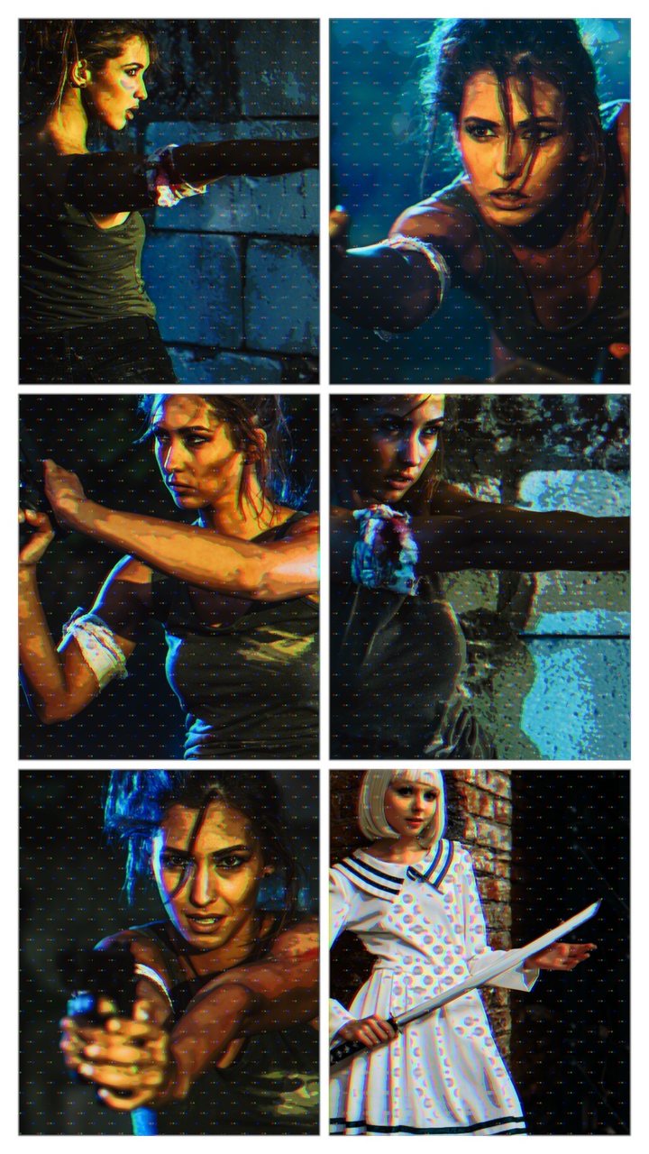
Six layouts, left to right and top to bottom: 2-2-2, 1-2-2, 2-1-2, 1-1-1, 1 and Cover. Each is one page of a spread, and each page picks its own layout. Cover runs edge to edge with no margin: this one is the right page of a front cover, with the left page set to Empty.
How layouts are named
Rows, top to bottom
A grid layout is named by its rows, top to bottom, and each number is the panels in that row. 2-2-2 is three rows of two panels. 1-2-2 is one wide panel on top and two rows of two under it. 1 is one panel filling the page. There are 13 grids, and each page picks its own. A panel's well number follows its place: the first row is wells 1 and 2, the second row 3 and 4, the third row 5 and 6, and a row with one panel uses the first well of its row. So changing a layout never moves a clip to a different panel.
Default 2-2-2 on both pages
Cover and Empty
The ends of a book
Cover is well 1 over the whole page, edge to edge with no margin, because a cover with a margin does not look right when the page turns. Empty is no panel and no paper: a clear page that shows whatever is below it. A front cover is Left Empty with Right Cover. A back cover is Left Cover with Right Empty.
Hidden wells stay listed
Inspector
A layout with fewer panels hides the extra ones, but their wells stay in the inspector, because a generator cannot hide a well. A hidden well keeps its clip and its framing, and both are back when you choose a layout that shows that panel again. Pointing Zoom Panel at a hidden panel does nothing.
The vertical page
Comic Book Vertical
Comic Book Vertical is one page, so it has one Layout row and the wells Panel 1 to Panel 6. It has the same grids and Cover, but no Empty. It suits portrait clips: a landscape clip shows only its middle slice.
Comic Book Vertical in a 9:16 project: one page on 2-2-2, with all six panels filled.
Framing a panel
Pan X, Pan Y and Zoom
Every well · keyframe me
Zoom 0 fills the panel with the clip, so whatever does not fit the panel's shape is cut off: a 16:9 clip loses its sides in a 2-2-2 panel, and a Cover shows only the middle of it. Zoom 100 goes in four times closer. Pan X and Pan Y slide the picture inside the panel.
Default Zoom 0, Pan 0
Zoom in before you pan
When the paper shows
A panel shows as much of its clip as fits. Where the clip already fills the panel, there is no room to pan that way, so the picture slides over and the paper shows at one edge. Zoom in first, and there is room. On the vertical page this is the sideways direction: a landscape clip has no sideways room at Zoom 0, and neither does a 9:16 clip in a panel wider than 9:16. Pan X shows the paper at once there, until you zoom in.
A short clip stops early
Clip length
A clip that is shorter than the generator stops before the generator ends. Lengthen the clip, or shorten the generator. A compound clip with text loses its text when it ends (see Text on the page).
Freeze a panel
Freeze frame · still image
A freeze frame or a still image in a well holds the panel still, and Zoom and Pan still work on it. A one-frame range in the browser does not freeze a well: it brings in the whole clip.
Retimed clips
Compound clip
A well plays its clip as it comes. To use a retimed clip, select it, choose File ▸ New ▸ Compound Clip (Option-G), and put the compound clip in the well.
Frame Hold in a panel
Not on the generator
The generator has no Frame Hold, because a well hands over only the current frame. To hold a panel on twos, threes or fours, put the hold on the clip first: make a compound clip, add the Comic Book effect inside it with Frame Hold on, and put the compound clip in the well. A clip exported with the hold already in it works too. Set the generator's Intensity to 0 so the generator does not draw its look over the held one a second time. Twelve compound clips with an effect each can be slow to play live, depending on your Mac. Rendering them first can help: select them and choose Modify ▸ Render Selection (Control-R).
Panel zoom
Zoom Panel set to Left 1, with Zoom Amount at 0, 25, 50 and 100, left to right and top to bottom. At 0 the panel sits in its place; at 100 it fills the whole frame.
Zoom Panel and Zoom Amount
Popup · 0 to 100
Zoom Panel picks a panel, or Off. Zoom Amount takes that panel from 0, where it sits in its place on the page, to 100, where it fills the whole frame in front of everything else. In between it grows smoothly, so move Zoom Amount over time to push into a panel. The look is drawn after the zoom, so a zoomed panel wears the same Style as the rest.
Default Zoom Panel Off, Zoom Amount 0
Change Zoom Panel any time
Popup · switches at once
Final Cut Pro cannot keyframe a popup, so Zoom Panel does not animate. Change it at any time, even partway through a zoom, and the zoom switches to the new panel at once. For a smooth hand-off from one panel to another, bring Zoom Amount back to 0, change the panel, then zoom in again.
The paper and the look
Paper Color and Paper Texture
The sheet
Paper Color colors the sheet behind the panels. Paper Texture adds an aged-paper texture to it, and at 0 the paper is clean. Both cover both pages, margins and the gaps between panels included, and neither touches the panels.
Panel Grain
0 to 100 · on the panels
Panel Grain is the grain on the panels themselves. It is the effect's Paper Texture under another name, so it adds the same fine grain and coarser layer, and it never reaches the paper.
One look across the spread
Applied once
The generator applies Comic Book once, to all the panels together, not once per panel. That keeps rendering cheaper and lets the dots run on unbroken from panel to panel. The look never reaches the paper. Because it is one look, Rings are centered on the Animation Anchor across the whole spread, and Drift on Rings grows them outward from it. Subject sees the spread as one picture.
What the generator leaves out
No Frame, no Frame Hold
The generator has the effect's look controls: Style, Intensity, Preserve Luminance, the dots, Subject, Dot Animation, Stability and Advanced Options. It has no Frame, since the page is the frame, and no Frame Hold (see above).
Do not drag the Comic Book effect onto the generator
The effect styles the whole frame, so it puts dots on the paper too. Style the spread with the generator's own look controls.
Text on the page
Text over the page
Title above the generator
The generator has no text of its own. A title on a lane above it sits on top of the dots instead of under them, and no panel scales it down, so at the same size it reads more clearly than text inside a well. It does not turn with the page: for text that has to be part of a page turn, put it in a well.
Text in a panel
Compound clip · Title
Make the compound clip as long as the generator. The text disappears when the compound clip ends: a 2-second compound clip in a 5-second generator loses its text after 2 seconds. To put words in one panel, make a compound clip with a title over a solid color and put the compound clip in the well. Use this when the text has to be part of a page turn: it turns with the page. The solid is needed: plain black text does not show in a well, so put a white solid under it. Any color works. The well's thumbnail in the inspector shows the title, not the solid under it; the panel still shows both.
A well fills its panel, so the edges of the compound clip are cut off wherever the panel is not 16:9: keep the lettering toward the middle. In most layouts a panel is smaller than the frame, so the clip is scaled down to fit and the lettering shrinks with it.
With Intensity above 0 the comic look is drawn over the lettering too, like the rest of the spread. When the dots are on, the lettering needs to be bigger: the dots can swamp small or thin type. Use large, bold type, and give it a large panel: a Cover fills the whole page and is the biggest. How big is big enough depends on the typeface and on how large the picture plays, so judge it at the size your audience will watch. Some Styles leave lettering easier to read than others, so try a few. Intensity belongs to the whole spread, so setting it to 0 to keep the lettering clean also takes the look off the other panels.
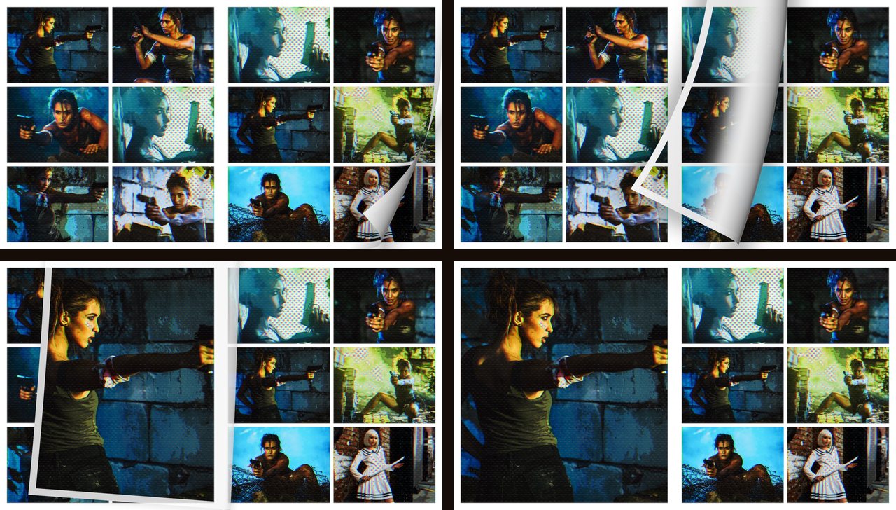
The page turn
Comic Page Turn between two spreads, in four moments, left to right and top to bottom: the corner lifting, mid-turn, nearly landed and landed.
What it does
16:9 and 9:16
Comic Page Turn lifts the free corner of the right page, carries it across the spine and lands it flat on the left page. The next spread shows underneath it and through the back of the page. Comic Page Turn Vertical is for single pages: the page lifts at its bottom right corner and sweeps off past the left edge of the frame, hinged on that edge. There is no page for it to land on. Use the turn that matches your project.
Length
Any length · 10 frames or more
A turn dropped on a cut takes Final Cut Pro's default transition length, which you set in Final Cut Pro ▸ Settings ▸ Editing. It fits any length you drag it to. A turn under 10 frames still works, but we suggest 10 frames or more, so the page is on screen long enough to read as a turn. On a long turn the page lands a little before the end, so the last moments show only the next clip.
The paper on the turn
Nothing to set
The turn has no controls of its own. The margin and curl of the turning page take the paper color of the page that is leaving, and fade out toward the end. The picture on the back of the page is the next clip. A plain clip under a turn works too: the turn reads its paper color from the clip's own edges, and a clear picture gives white paper.
Covers and the lanes below
16:9 turn
A front cover has nothing on its left side, so that side is see-through: it shows whatever is on the lanes below until the cover lands. Put a clip there on purpose, or keep that lane clear. The vertical turn has no left page, so it has no see-through side.
Playback
A turn that stutters is usually unrendered
Control-R
Played live and unrendered, a turn can stutter. Select the clips on either side of it and choose Modify ▸ Render Selection (Control-R), and it plays smoothly. A turn that stutters live does not stutter in the export.
A clip at another frame rate
Repeated frames
A clip whose frame rate differs from your project's repeats a frame now and then. A 25 fps clip in a 30 fps project repeats one frame in six. It shows most at the start of a turn, where the page moves slowest. The repeats belong to the clip, not the turn, and the turn itself stays smooth in the export.
Heavy stacks under a turn
Dropped frames
A turn between two spreads is heavy to play, and whatever sits under it adds to the load. A third Comic Book clip stacked under a turn between two spreads drops frames. Keep what sits under a turn light, and render.
Twelve clips and keyframes
Slower playback
Playback can slow down depending on your settings, your Mac and what you add. Keyframing with all 12 wells filled can be slow.
Use optimized media or ProRes
Real-time playback
H.264 clips in the wells can stutter even with only six wells filled. Twelve ProRes wells played in real time on an Apple M3 Mac, and so did optimized media. To make optimized media, select the clips in the browser, choose File ▸ Transcode Media, tick Create optimized media and click OK. Then click the View pop-up menu in the upper-right corner of the viewer and choose Optimized/Original under Media Playback.
Good to know
Tips and limits
A few things that save you a headache, and what Comic Book can't do.
Judge the dots at 100%
Viewer size
Fine dots and fine texture are easy to misjudge in a scaled-down viewer, because the viewer shows a resampled picture. Set the viewer's zoom menu to 100% before you decide on a Dot Size.
Stability and smooth playback
Playback only
Stability makes the app fetch extra frames for every frame it shows, so live playback can stutter. Render the shot and it plays back smoothly: select the clip in the timeline and choose Modify ▸ Render Selection (Control-R). Your export is not affected: every frame renders in full.
Frame On covers what is behind
Opaque page
With Frame On, the output is an opaque page, so anything behind the clip is covered. If you want a clip over a background, leave Frame Off.
If a spread or a turn looks wrong
What you see
What is happening, and what to do
Dots on the paper
The Comic Book effect is on the generator. Take it off and style the spread with the generator's own look controls.
Paper shows at the edge of a panel
You panned past the clip. Raise Zoom, then pan. On the vertical page, Pan X shows paper at once until you zoom in.
A turn stutters when you play it
It is not rendered. Select the clips on either side of it and press Control-R. The export is smooth.
A frame repeats now and then
The clip's frame rate differs from the project's. The repeat is in the clip, not the turn.
A clip stops before the generator ends
The clip is shorter than the generator. Lengthen the clip or shorten the generator.
Playback is slow with many wells
Use optimized media or ProRes in the wells, and render. H.264 can stutter even with six wells.
Text in a panel is missing
Plain black text does not show in a well: put it in a compound clip over a solid color. Text that vanishes partway: make the compound clip as long as the generator.
A clip looks zoomed in
A well fills its panel, so wherever the panel is not 16:9 the clip's edges are cut off. Keep what matters toward the middle.
The turn goes by too fast
It is very short. Keep a turn at 10 frames or more. Drag it longer.
A thin line down the middle of the book
Both pages are set to Empty. Give one of them a grid or a Cover.
About flashing: a photosensitivity note
Dot Animation (Boil and Vibrate especially), Frame Hold, and the trial's periodic TRIAL flash change the picture quickly. Images like these can trigger seizures in people with photosensitive epilepsy, including people with no history of it. If your audience may include photosensitive viewers, keep Animation Speed low and give a warning up front.
Cheat sheet
Quick reference
The sliders at a glance, from one end to the other, with where each starts on a fresh drop (Offset Comic).
The look
Control
Low end
High end
Starts at
Intensity
0: your original
100: the full look
75
Halftone Amount
0: no dots
100: full-strength dots
70
Halftone Dot Size
0: fine (about 120 up the frame)
100: big (about 20 up the frame)
40
Halftone Dot Evenness
0: dots follow brightness
100: all dots the same size
20
Smoothing
0: keeps every speck
100: flat, few stray lines
50
Line Weight
0: thin pen
100: heavy pen
55
Ink Darkness
0: only the strongest edges
100: most of the frame inked
45
Line Variation
0: edges ink at full weight
100: weak edges stay faint
50
Line Taper
0: only strong edges start a line
100: weak edges start thin lines
50
Contrast
50: flatter
200: much harder (100 is neutral)
125
Shadow Lift
0: shadows as they are
100: shadow detail lifted
0
Shading Levels
2: three tones
16: seventeen tones
5
Tone Softness
0: hard bands
100: soft band edges
0
Hatch Strength
0: no lines
100: dark lines
60
Hatch Size
0: many fine lines (about 110)
100: few wide lines (about 30)
50
Hatch Angle
0 degrees
180 degrees
45
Spot Black
0: none
100: most solid black
0
Color Boost
0: black and white
200: double color (100 is unchanged)
150
Temperature
-100: cool and blue
100: warm and sepia (0 is neutral)
5
Color Offset
0: perfectly registered
100: widest red and blue fringe
55
Paper Texture
0: clean
100: heavy grain
20
Time, subject and page
Control
Low end
High end
Starts at
Animation Speed
0: still (Boil keeps jumping)
100: double speed
50
Stability
0: off
100: steadiest, can smear slow motion
0
Luminance Low
0: from black
100: only the brightest
0
Luminance High
0: only the darkest
100: up to white
100
Key Tolerance
0: strict
100: lets in neighbors
50
Feather
0: the source's own edge
100: wide soft edge
10
Subject Dots
0: subject gets no dots
100: same as the background
100
Subject Ink
0: subject gets no ink
100: same as the background
100
Source Width
20: small on the page
100: fills the frame
90
Border Width
0: a hairline
100: thickest border
40
Before you install
System requirements
Comic Book is a Mac video plugin. Here is what you need.
Operating system
macOS 13.5 or later
Ventura 13.5 and up.
Works in
Final Cut Pro 10.8.1 / Motion 5.8 or later
The effect works in both. Pages (the generators and the page turns) work in Final Cut Pro only.
Mac type
Apple silicon Mac
M1 or later.
Installing
Via FxFactory
Free trial with watermark; buy it in FxFactory.
Get help
Stuck on something?
Trouble installing, a look not landing, or a control that won't behave? Reach out and we'll sort it.